I’m currently in the midst of another logo design project (update) that has been both challenging and satisfying and as I observe how that mark is evolving, I’m reminded that it’s helpful to document the design process (if only for my own record).
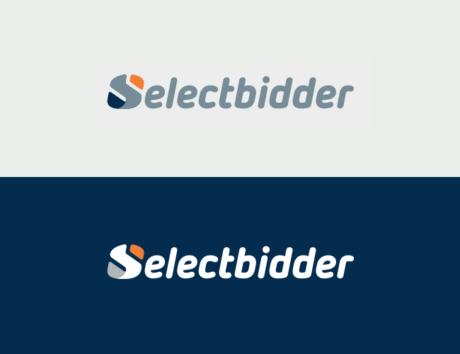
The Selectbidder logo design was part of a larger engagement to help create their web-based application. The first few weeks of the project were spent developing the new logo. The Selectbidder stakeholders were interviewed to get a sense of how they wanted their brand to be perceived and a research phase was conducted before I got to work sketching out ideas.
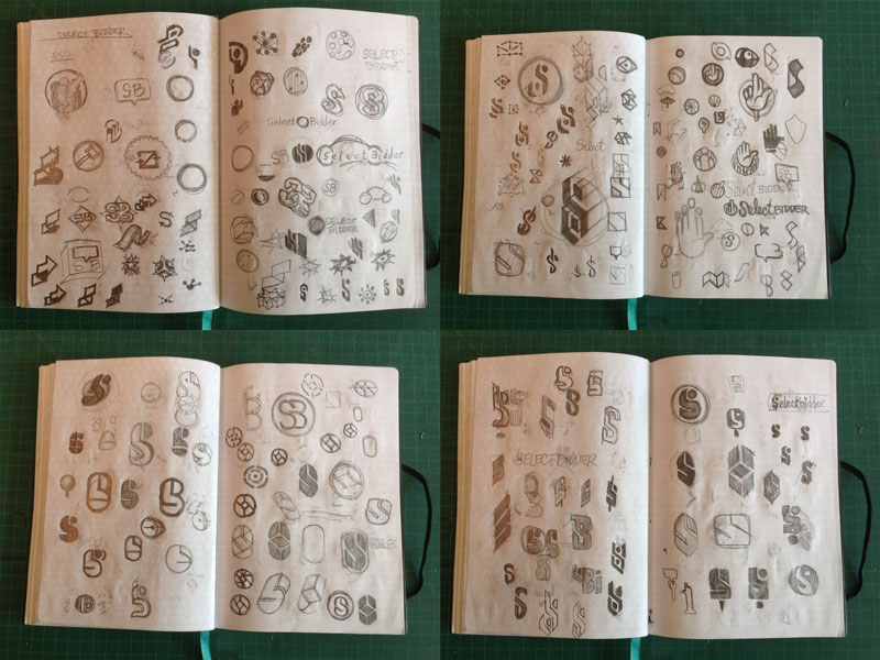
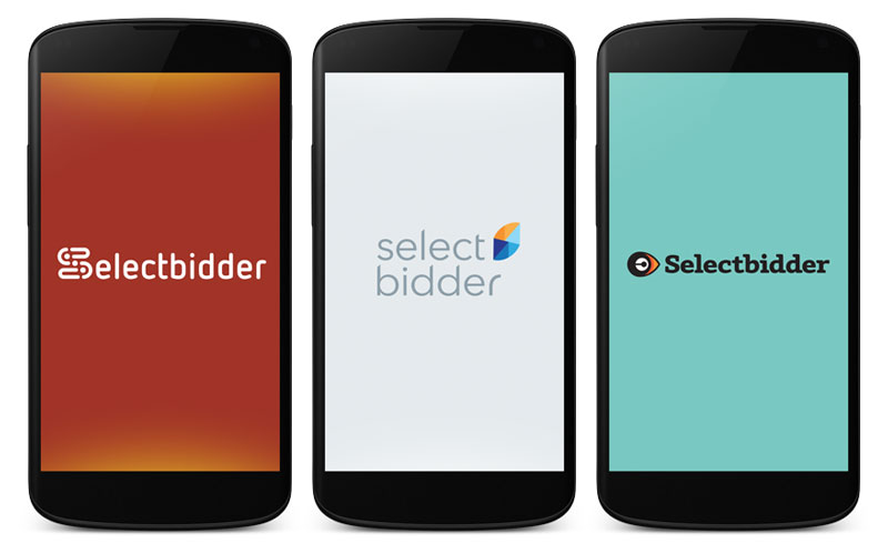
Given that the audience was primarily car-savvy men, the mark needed to appropriately reflect that — and since this was going to be an app, it had to work as a stand-alone icon. Bold and strong abstract shapes were explored and more literal metaphors were considered. However, as the initial ideas were reviewed, it became apparent that trying to illustrate the bidding process was difficult. I eventually started gravitating towards a simple typographic approach and after some initial feedback, I focused on refining three concepts a bit further.
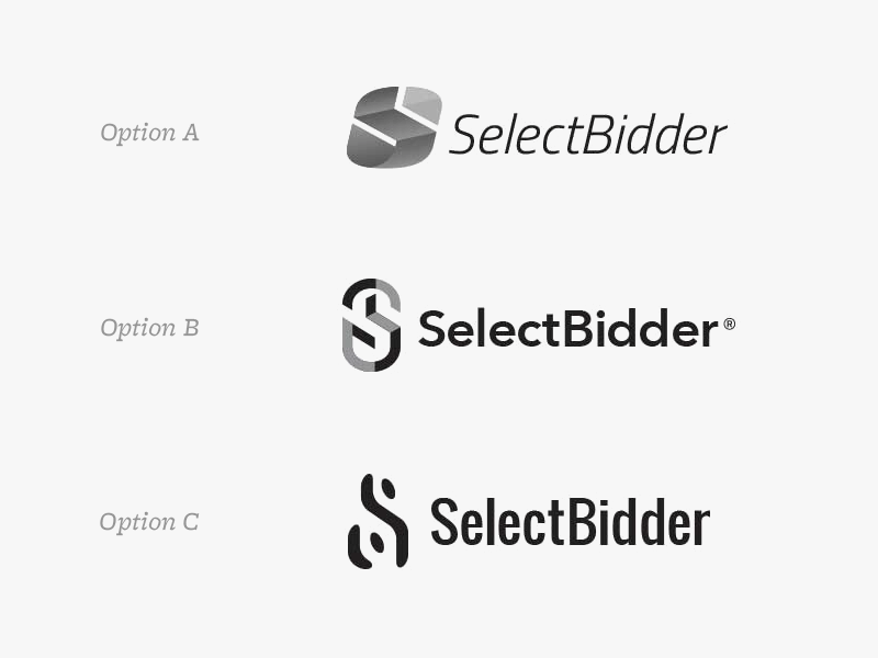
After it was decided that Option A was the preferred direction, the icon was refined, typography was explored further and colour palettes and variations were considered. FontFont’s Netto Black Italic was chosen as the icon’s supporting typeface.
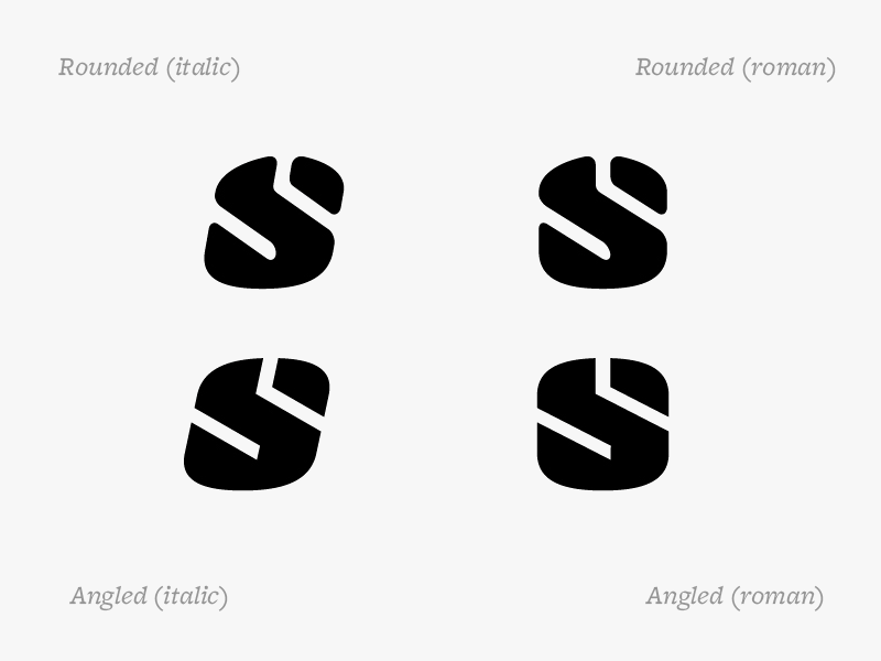
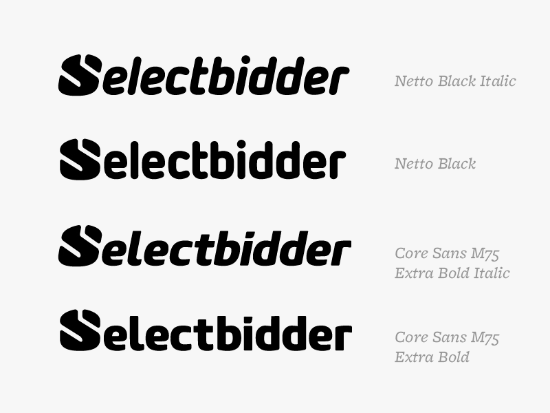
Despite my preference for sketching out initial ideas on paper, I’m not averse to working digitally for idea generation. If I’m inspired typographically, or if I have a fairly specific concept that I feel will be easier to execute on the computer, I will explore ideas in Adobe Illustrator. In this case, none of the explorations were successful.
Completing the identity were typical stationery items (letterhead, business cards, slide deck templates) as well as a brand guide document.
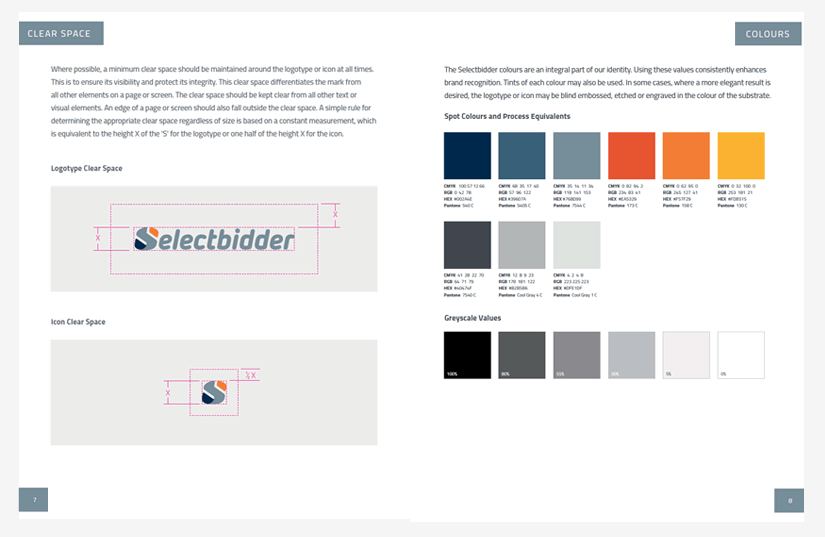
I’m becoming less enamoured with this type of static deliverable and instead I’m thinking that online, “living” style guides that encompass UI elements as well as brand assets are more useful for an organization. For my next large identity project, that is definitely something I’ll push for.